Life Book 2014 – Week 16

This week our teacher is the very fun Traci Bautista! We were to create “in the moment”, which is hard for me to do. I plan everything! So this random play was both fun and hard for me.

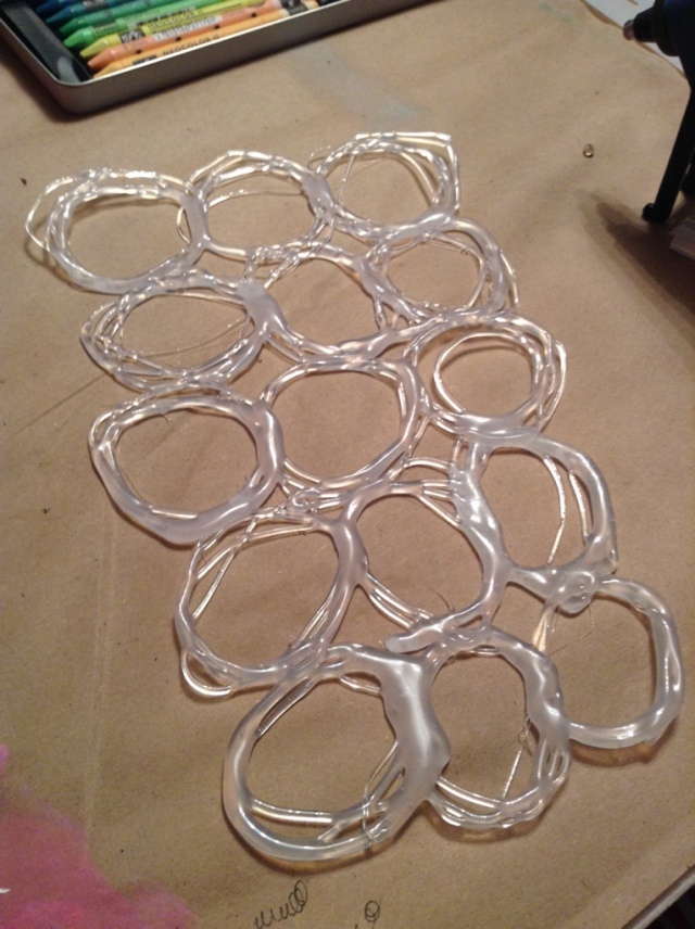
First, she showed us how to make hot glue stencils. Why have I not been doing this already? Such a simple concept, but an amazingly cool technique!

20140418-142251.jpg

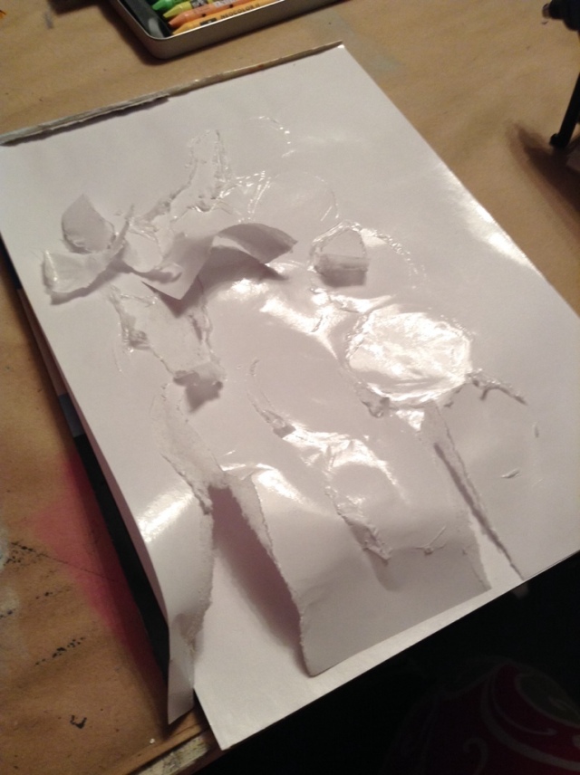
I made the hot glue stencil on my palette paper (my daughter was using my Teflon sheet), but it did NOT come off of it very well. I will definitely be using the Teflon next time!

20140418-143033.jpg

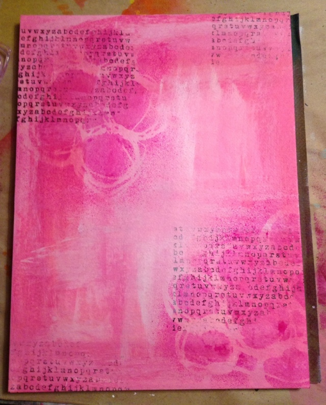
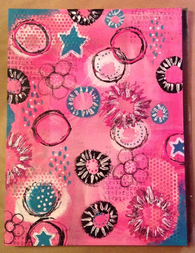
I painted pink, in different shades, all over my page. I used some of those cheap paints you get in the little bottles. They are thinner paint and blended more easily. I also used my new hot glue stencil with some spray inks.

20140418-143340.jpg

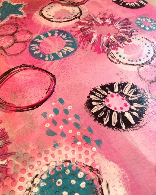
Then I just played and played and played. I stamped, used a toilet paper roll, sprayed a silver glimmer spray through a stencil (which doesn’t really show), painted stars and used the back of my brush to create dots.

20140418-143800.jpg

Fun stuff! I didn’t even wait for the paint to dry before I took the pictures. I plan on making a lot more hot glue stencils. What a great idea!

20140418-143948.jpg

Til next time…

20140418-144015.jpg

Life Book 2014 – Week 6 – Part Two

I think I’ve fallen in love with ink sprays! But sometimes I wonder if they are in love with me also. Or maybe they’ve put me into the friend zone…

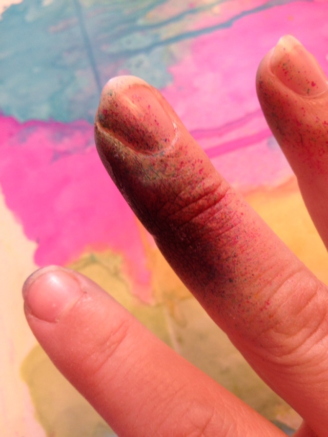
Watching Tamara’s lesson she made using ink sprays look so easy. And they can be… once you’ve got the technique down and your using the right paper. But no matter what, you’ll still end up with fingers that look like this.

20140209-094714.jpg

Not a big deal. I’ve suffered for art before. You should have seen my nails when I was working with glass. The grinder was not kind and I usually ended up with nails that looked like squirrels had been gnawing on them.

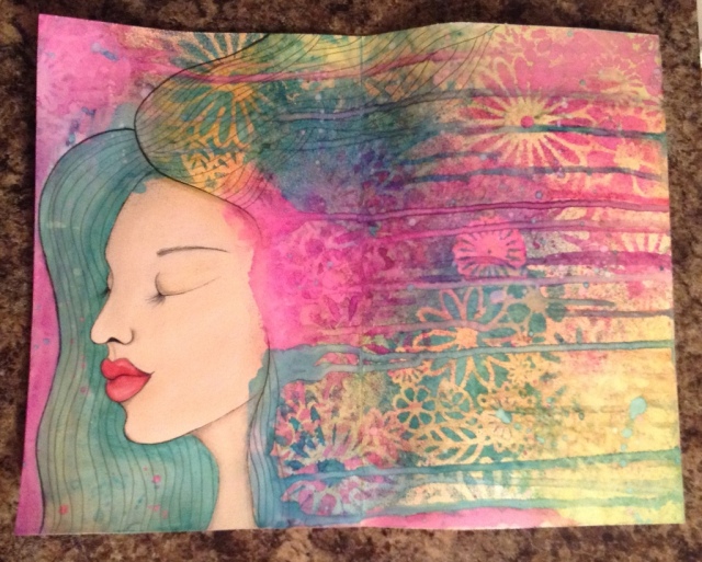
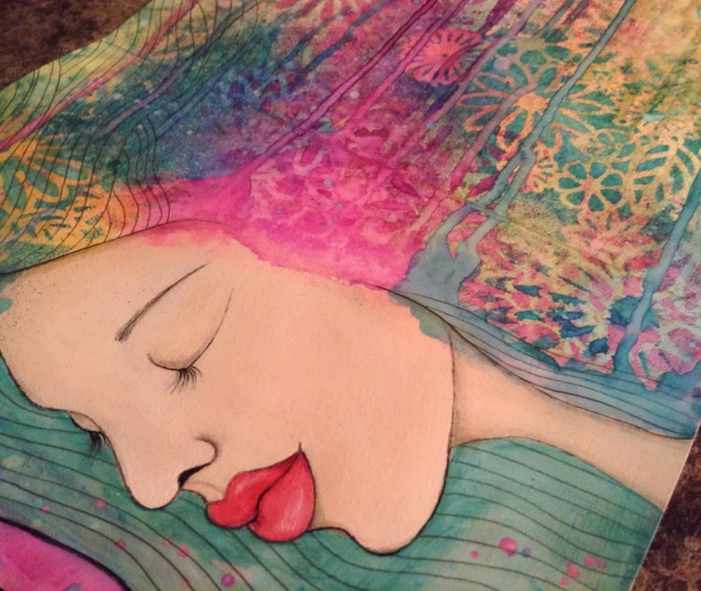
So here is my girl, with her lovely hair flowing wild and free!

20140209-194220.jpg

I love the combination of using ink sprays and a stencil. I did have some issues with the ink sprays though. Speckles would go all over the page. Some so small that you didn’t even know that they were there until you try to add some yellow and you end up with every other color but yellow when the speckles mixed in.

So in order to get some yellow on the page I waited for everything to dry and sprayed some yellow on at the end. But on my next piece I figured out a better technique that eliminated most of the speckles.

I really enjoyed drawing a different type of face. It was a little tough to go over some of the speckles, but I eventually got them covered.

20140209-194356.jpg

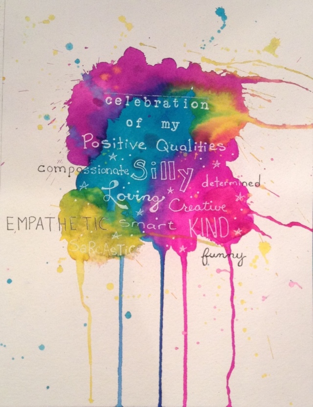
We were supposed to fold the paper in half and then put our Positive Qualities on the back. The only paper I had that was a bigger size was some Bristol (96 lbs) paper. So I gesso’d it. I wanted to make it thicker and a bit more substantial to work on. But in the end, I really struggled to get the vibrant color I was looking for. I believe the gesso was the culprit. It didn’t allow the ink to soak into the paper. So when I blotted some of the ink up with a paper towel it left a pastel version of the color. Not what I was looking for.

I struggled some more working on the back of the paper (gesso strikes again!) to make my Positive Qualities page. So I gave up and started it on a new piece of watercolor paper. What a difference! Strong, vibrant colors! On this piece, I figured out a technique so you don’t get speckles of color everywhere. Hold the spray bottle extremely close to the paper. Did you hear me? Hold the spray bottle extremely close! So it’s pretty much touching the paper. That’s the key.

20140209-201053.jpg

As most of you know I have been loving this art course. I love to learn! But I didn’t realize how much I would enjoy all the love and support from all the members of Life Book and from Tamara herself. It may seem a little self indulgent at first to focus so much on yourself, but that’s not really what it’s about. It’s about encouraging and uplifting you as an artist and as a person. It’s about recognizing that you are good enough and what you create is worthy. I am so very grateful to have found this group and I can’t wait to see how much I’ll have grown by the end of the year. And it will all be there for me to see in my very own Life Book.

Til next time…

20140209-204254.jpg

Life Book 2014 – Week 4

If you’ve been following my blog, you know that I’ve been participating in an art course called Life Book. This is the result of my lesson this week.
20140122-142308.jpg

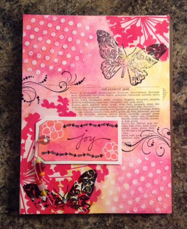
The teacher, Kelly Hoernig, asked us to pick three of our favorite things for our journal page. So I chose some type, polka dots and butterflies. I also included my word for the year “Joy” and my color for the year, Pink. We were supposed to use materials we had laying around.

The pink graphic flowers are from a huge poster I got from a Print Expo. Being at the expo and seeing all the free printouts and papers… I wanted to go nuts and shove them all in my free Epson bag. But I restrained myself, I was after all representing our business Stephen Edward Graphics.

The polka dots were made from a stencil and some heavy gesso. The butterflies and the word Joy came from some stamps I received just last week. My husband knows how much I love Donna Downey’s work and bought me a gift certificate for Christmas for her online shop. So I loaded up on a bunch if her stamps. I have to say, they are really nice quality and LARGE! I love that!

The “amusement” type came from some Tim Holtz tissue paper. I really wanted a dictionary or thesaurus page with the word Joy, but I didn’t have one. But amusement is close enough. I am determined to get out if the house this week and go to our local bargain shop, Bargains Galore, and find some old books. I really love the way type looks in the background of a piece.

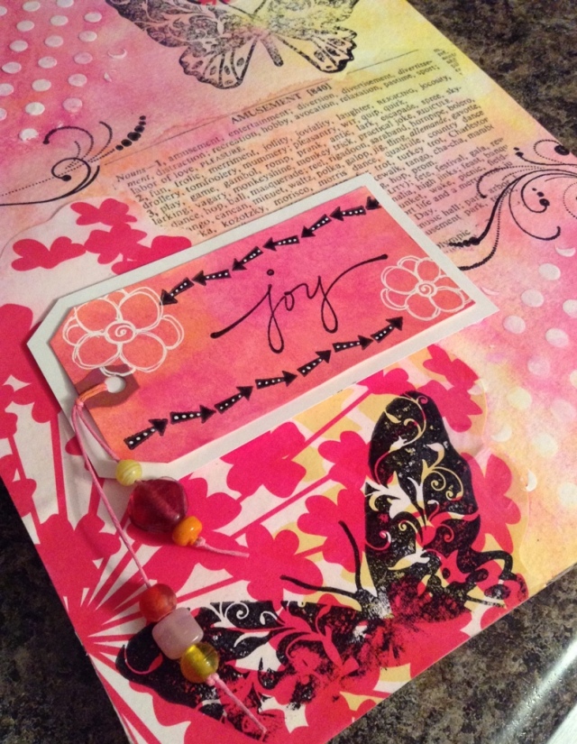
The tag is just a normal tag that I got from Staples. I painted it, stamped it and drew some white flowers on it. I also cut up some white cardstock to mimic a tag and stuck it underneath. I just wanted the tag to pop off the background some more. It was blending in too much.

Lastly, I added some glass beads to the tag strings. The strings were so plain laying there. I couldn’t just leave them. I found a box of glass beads laying on the shelf. Cheap ones, kinda wonky. I think they were my daughters. They were the perfect addition. I didn’t even realize it until just now that I was representing glass in this piece about things I love. Wow! I am constantly surprised at all the “happy accidents” that occur like that.
20140122-144517.jpg

I posted it to our group’s Facebook page. I was a little nervous because it was very different than the teachers example. She had really muted colors and although I did try it the way I just couldn’t live with it. I’m a little too funky/crazy for that. Well, anyway… I got a lot of beautiful comments from the other members. And over 100 people “liked” it!

We are our own worse critic. Other people don’t see our mistakes. They only see the beauty. I need to try to be more like that towards myself.

Til next time…

20140122-145348.jpg